Assnigment2 GeryBox Project
Evaluate 2 Unity Gray Box Project
Direction:
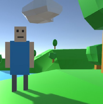
When you are on the home page (currently only the start button works on the home page), click the start button to go to the character control page. When you click the MoveLeft or MoveRight button, the character will move left and right. When the TurnLeft and TurnRight buttons are clicked, the character will rotate left and right. Click the Reset button and the character will return to its original position. Clicking the Home button will return to the home page.
User experience principles:
- Use fonts that fit the theme and are easy to read.
- There is feedback when the mouse is hovering over the button and when the button is clicked.
- Keeping the UI consistent prevents users from being unable to operate.
- The text is clearly structured, using a larger font size and bold italics for titles.
If you have any comments or suggestions after playing this game, you can leave them in the comments below.
| Status | In development |
| Platforms | HTML5 |
| Author | shenzhiqiaopai |
| Genre | Survival |
| Made with | Unity |

Comments
Log in with itch.io to leave a comment.
Hey bro! I really like your design, although it is still very rudimentary at the moment, I think it is enough to showcase your design ideas. Keep it up! Continue to develop your ideas, I believe you can make great games.
When a game's UI is designed to be so user-friendly and user-friendly, the entire gaming experience feels like an upgrade. From concise layout to intuitive operation, every detail exudes the dedication and professionalism of the development team. This UI interface not only makes the game easier to get started with, but also allows me to immerse myself more deeply in the game world and enjoy the fun to the fullest. Thank you to game developers for valuing user experience, which allows us to easily explore every corner of the game and discover the fun and surprises within.